UX/UI Designer
Mailbird is an email client, originally for windows but now also available for Mac. I was responsible for redesigning the app back in 2019 and deploying a Calendar integration later on. I was also doing a lot of marketing material and illustrations.
Mailbird is designed to be simple and easy to use, with a modern, sleek design - but most of the design was made by developers. Create a design proposal (an image of the new proposed design) for the main mail overview that keeps with those ideals but improves upon the existing design where you feel there is room for improvement.
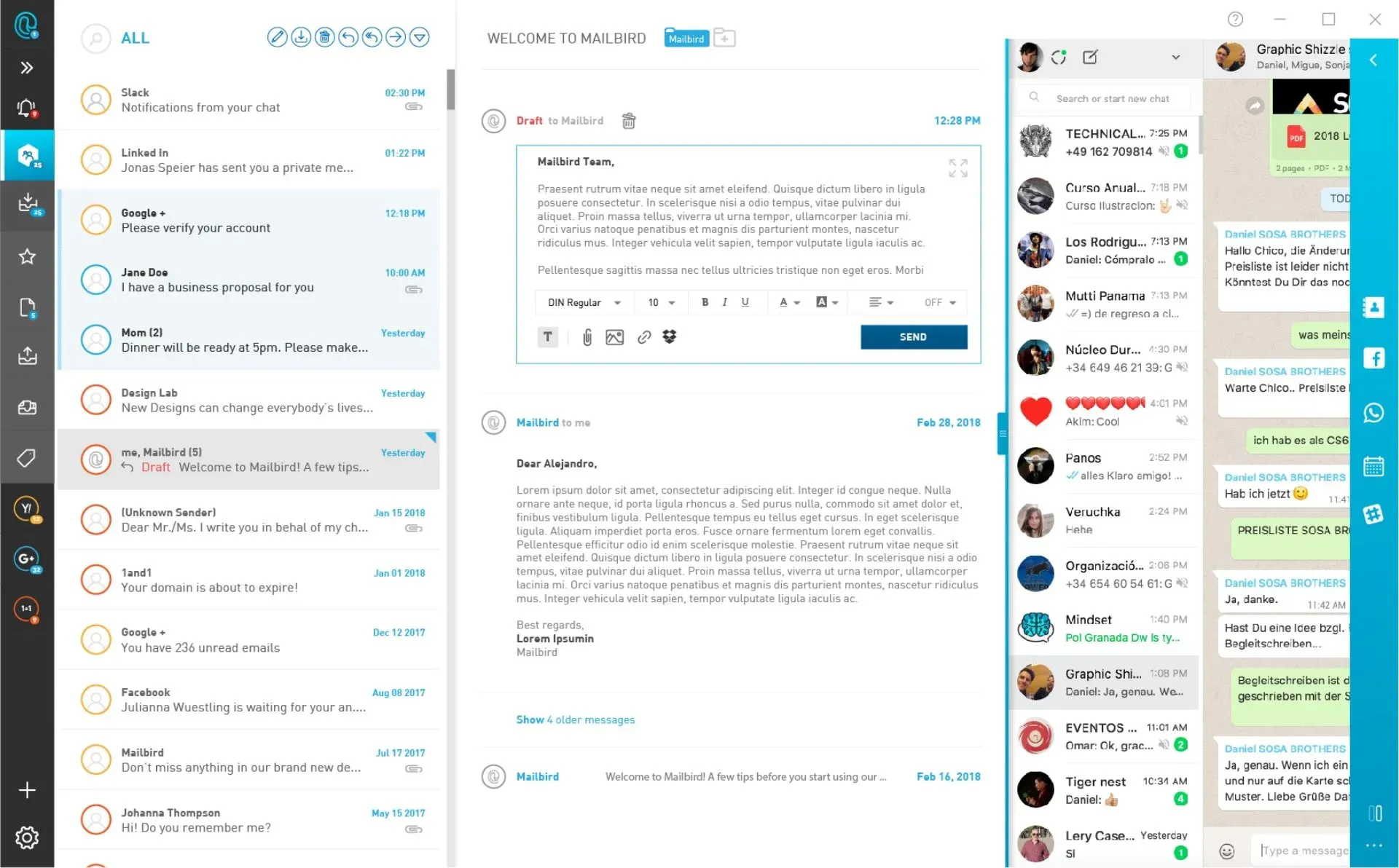
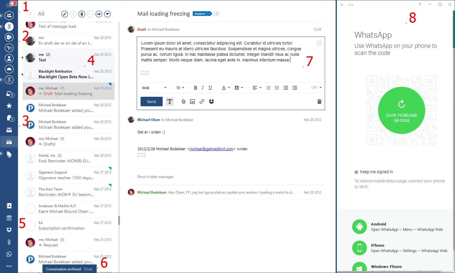
The combined main menu and notification center where we show info and error notifications. For error notifications especially this must be very visible so the user doesn’t miss them, but at the same time be "on demand" as opposed to being annoying for the user. The exclamation mark shown is due to an error notification being available.
List of activated apps. The middle being the contacts app that task 2 is referring to. A toast notification shown when doing certain things - in this case archiving a conversation.
The list of accounts added to Mailbird, the top one being the unified account that contains the folders and messages of all accounts.
What we call the inline compose window. Note the folder indicator at the top showing the conversation is in the ’Mailbird’ folder, with a button to add to another folder.
The special use folders of the selected account. Note the indicator for the number of unread messages in the folder (for the drafts folder this is the number of messages period). A couple of unread conversations with the selected conversation below. Note the draft indicator (’Draft’ in read), as well as the triangle indicator on the right denoting a folder the conversation is in.
The whole of the right side is the Mailbird sidebar, where certain apps can be shown. In this case WhatsApp. Note the top left triangle used to expand/collapse the sidebar.
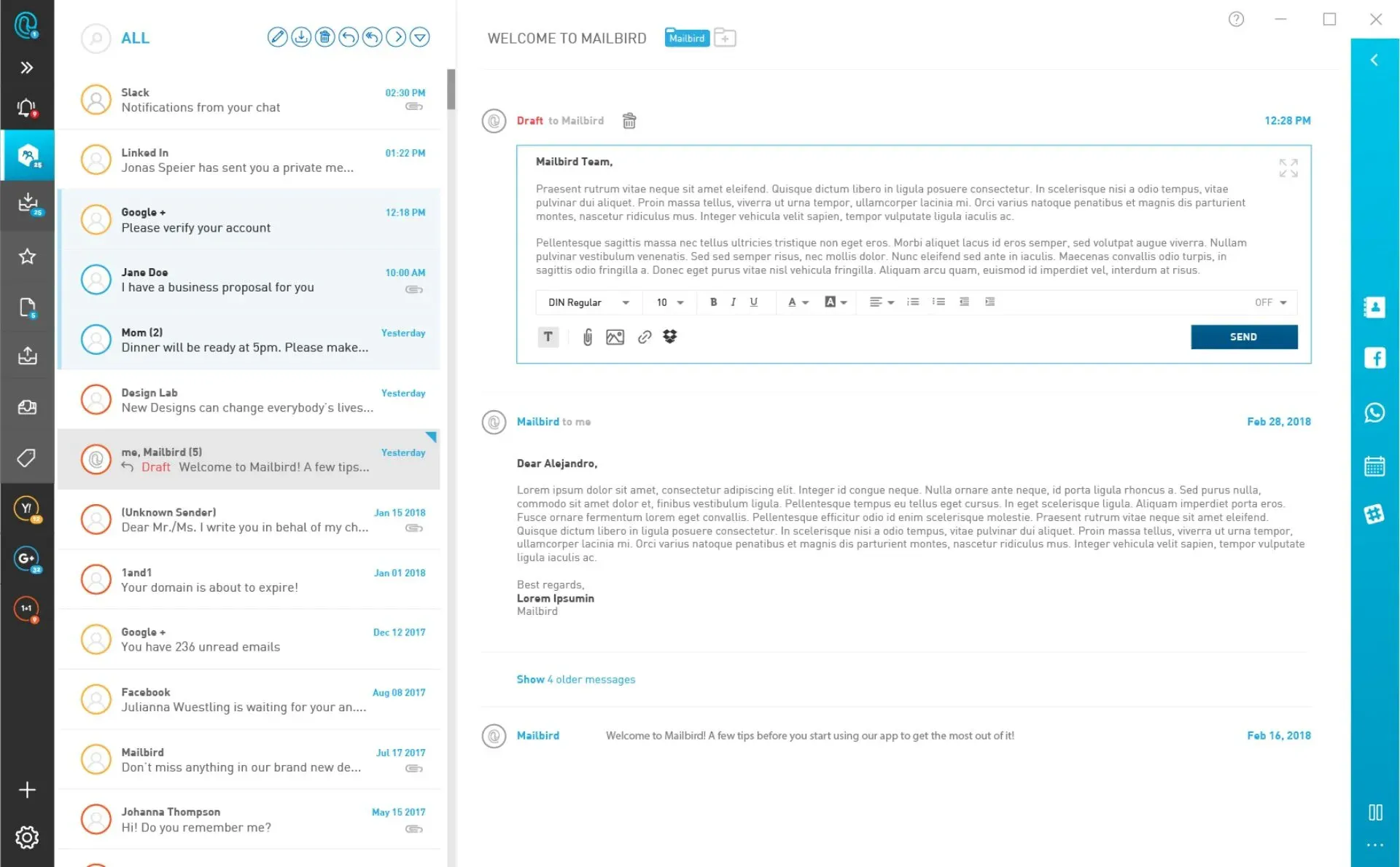
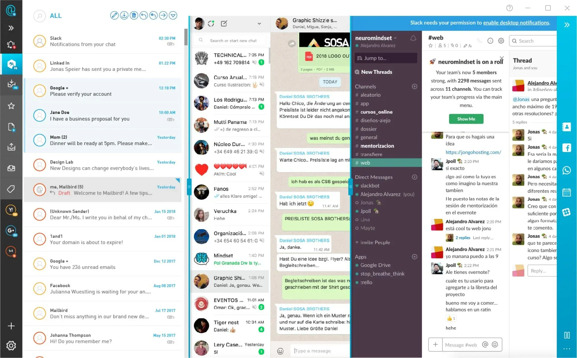
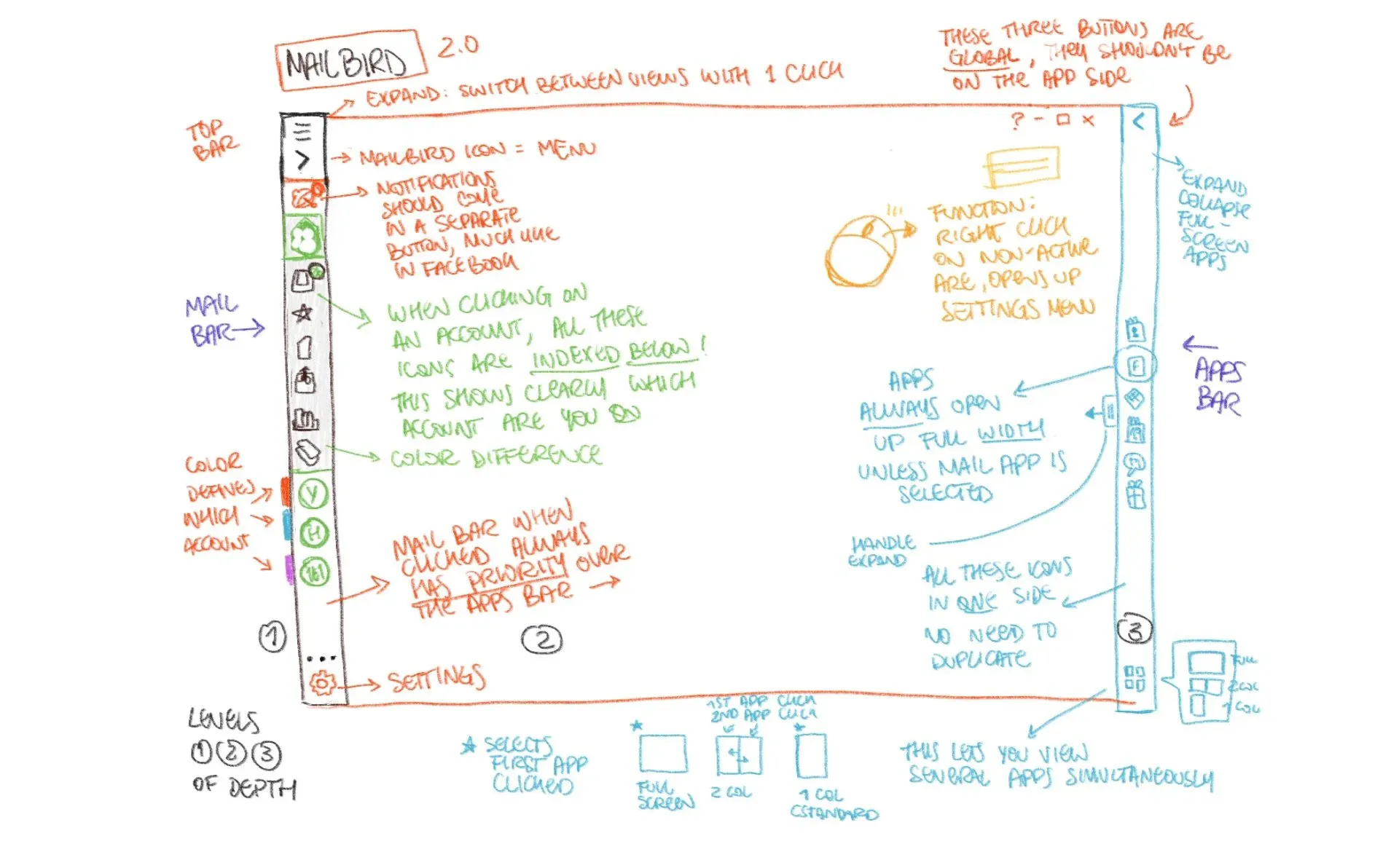
The main issue I found is that some icons were duplicated on both sides, also not giving enough room or space for the email icons.
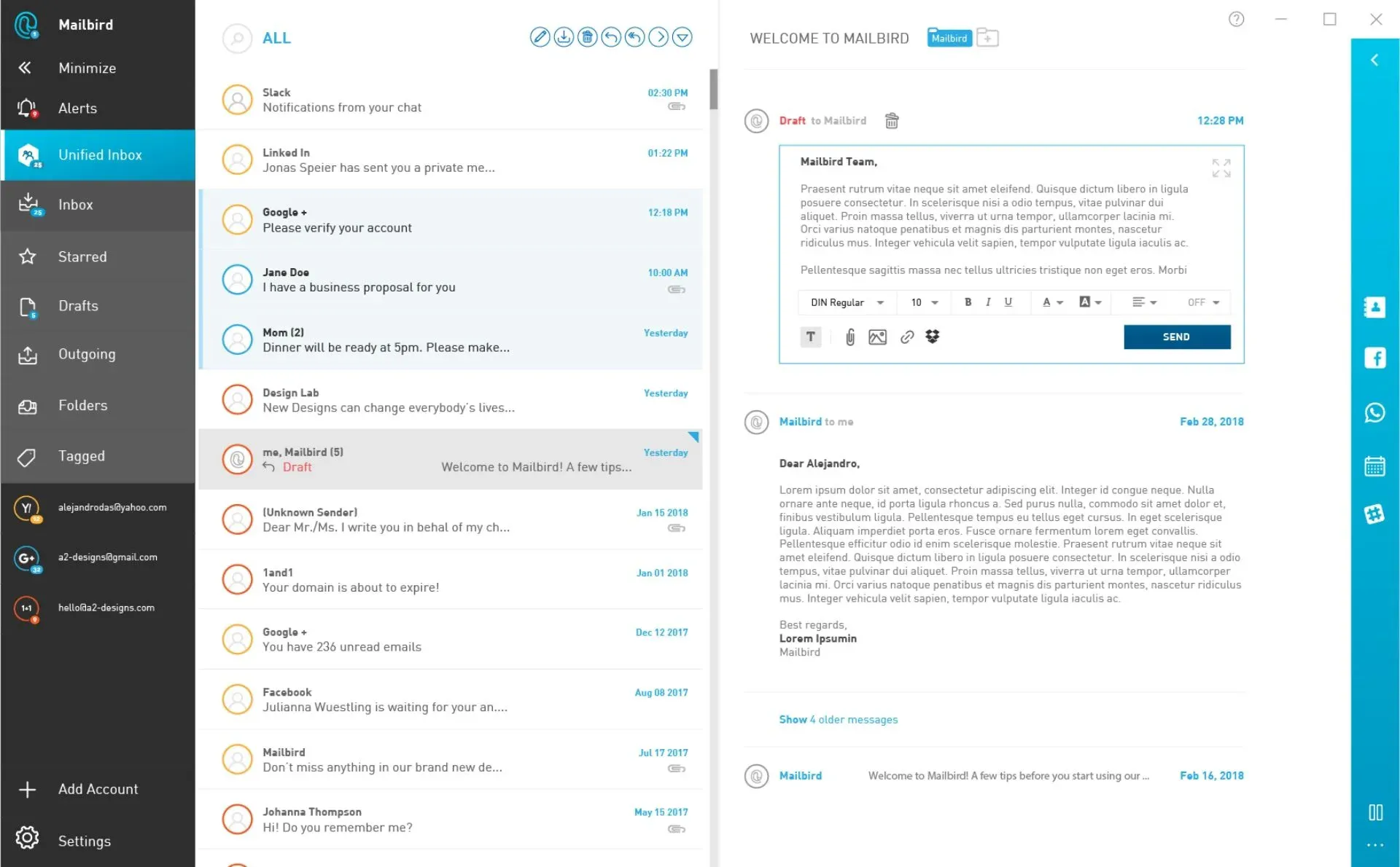
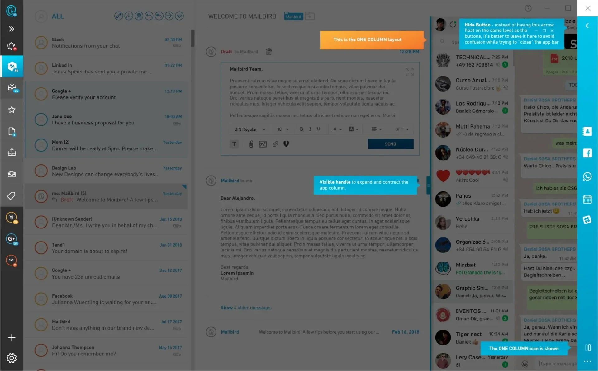
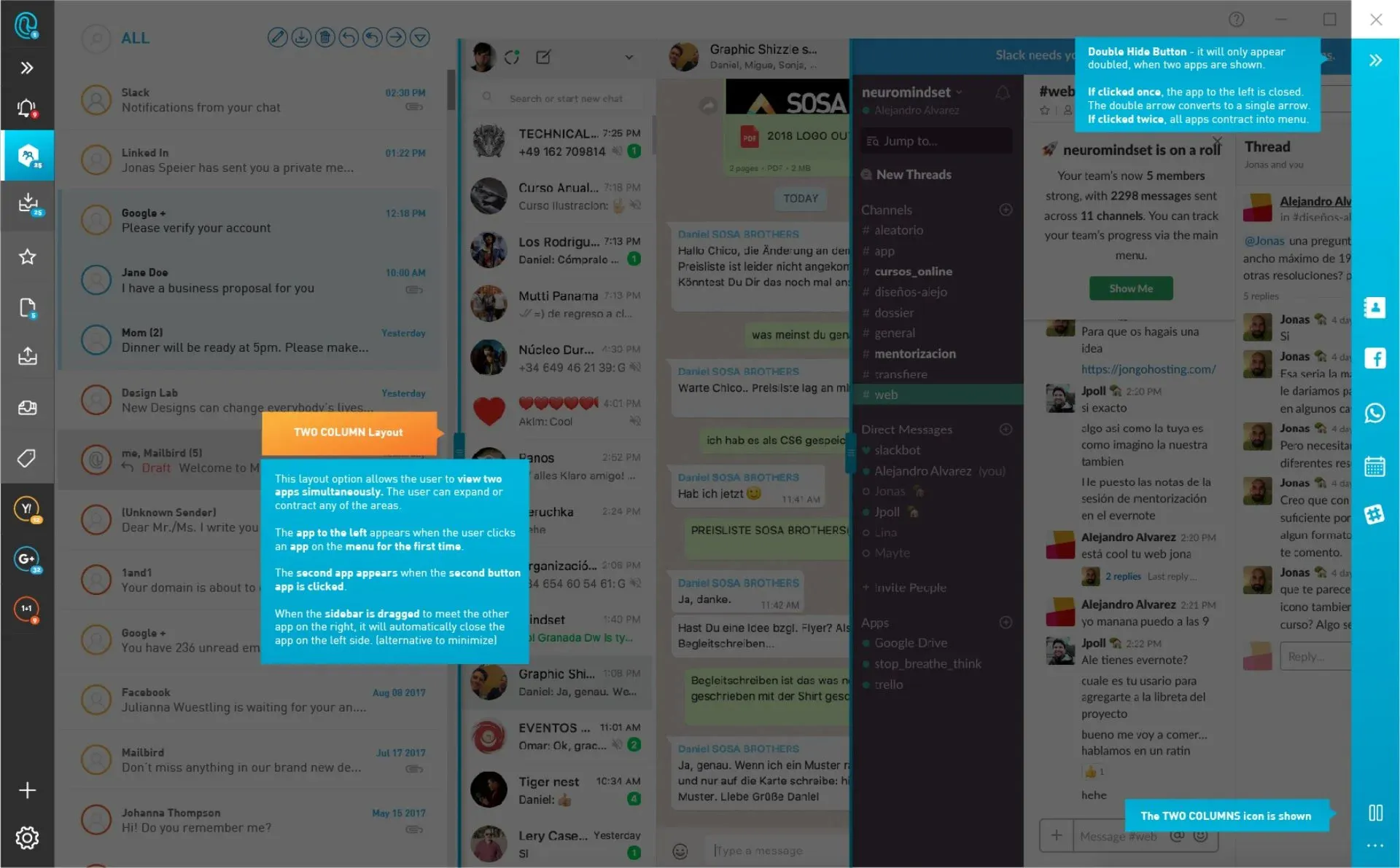
By separating them into two autonomous columns, the user can now focus on the left side with emails, and on the right side with apps
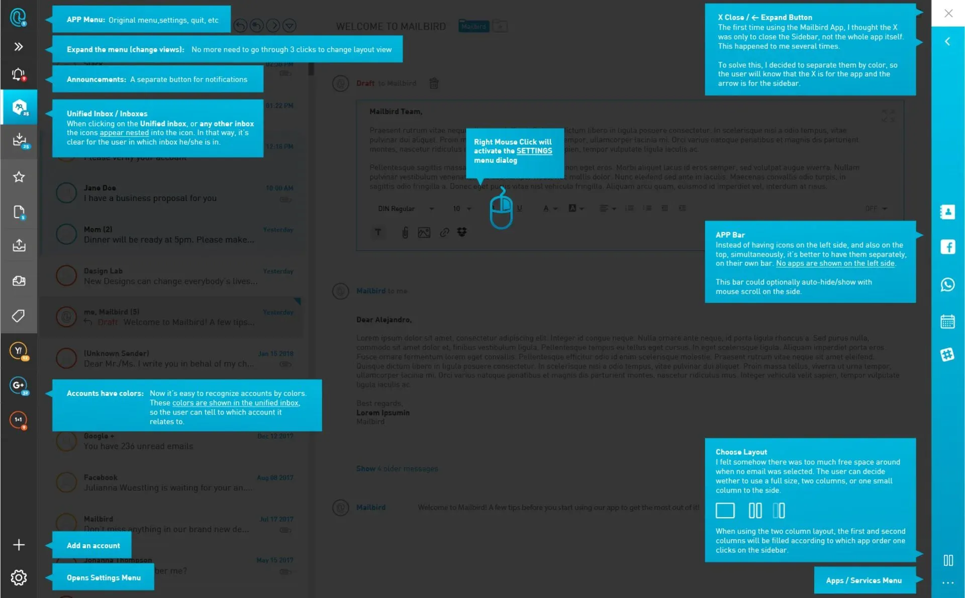
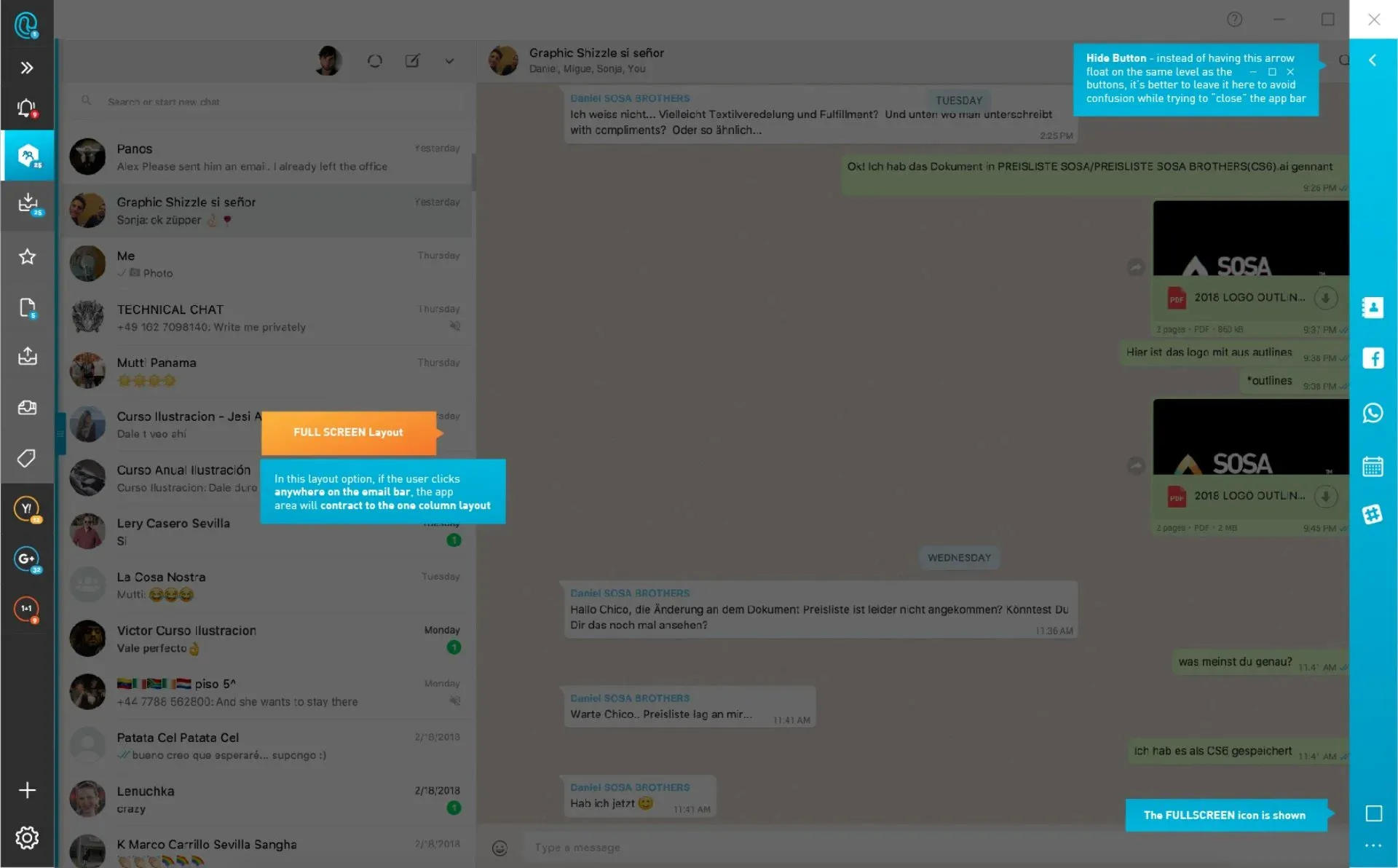
I decided to leave these icons alone, by not putting other icons (such as close app icon) next to it.
It happened to me several times, that I wanted to close the apps (not Mailbird), and I ended up closing the whole Mailbird application.
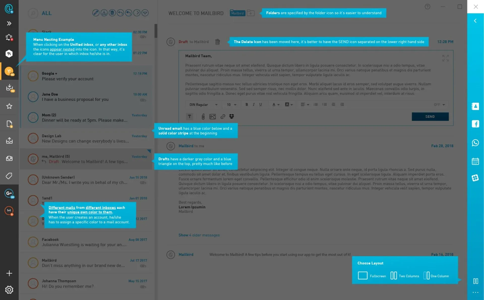
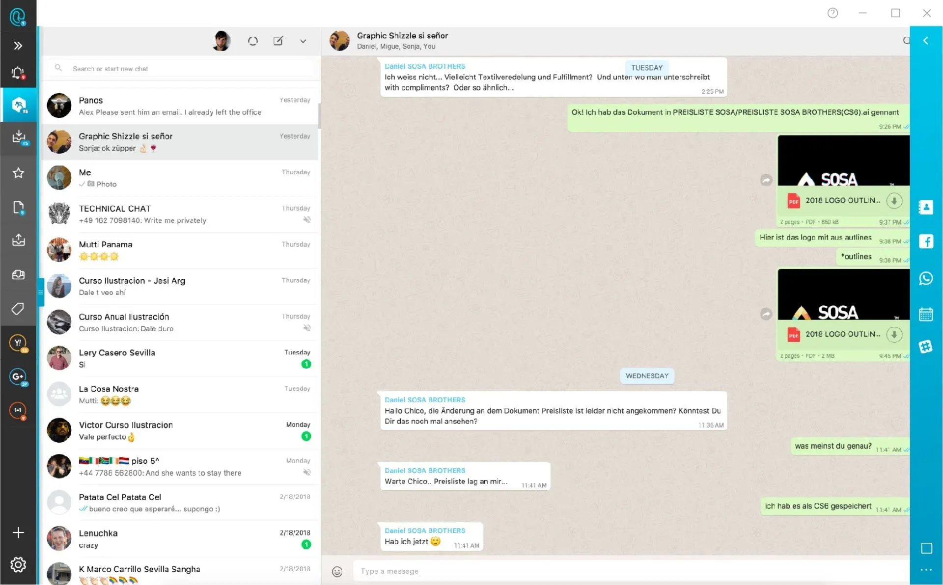
One can choose now wether to have a fullscreen (instead of app buttons on the left side), one column, and TWO columns.
That way, one can have an overview over all emails, and two communication / productivity channels.
Instead of going through the menu till one is able to change the layout, one can simply click the double arrow icon on the right menu.
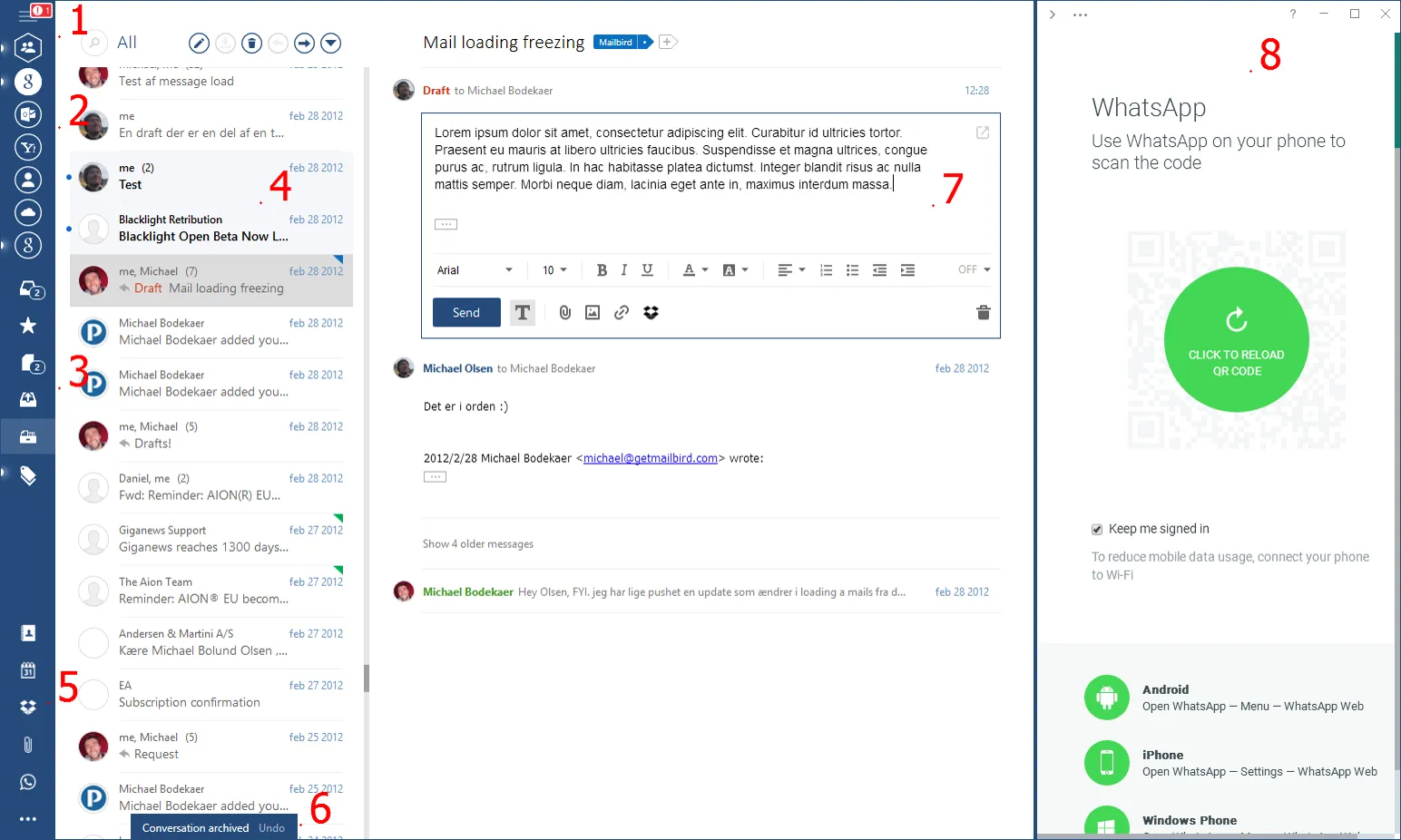
Before
After
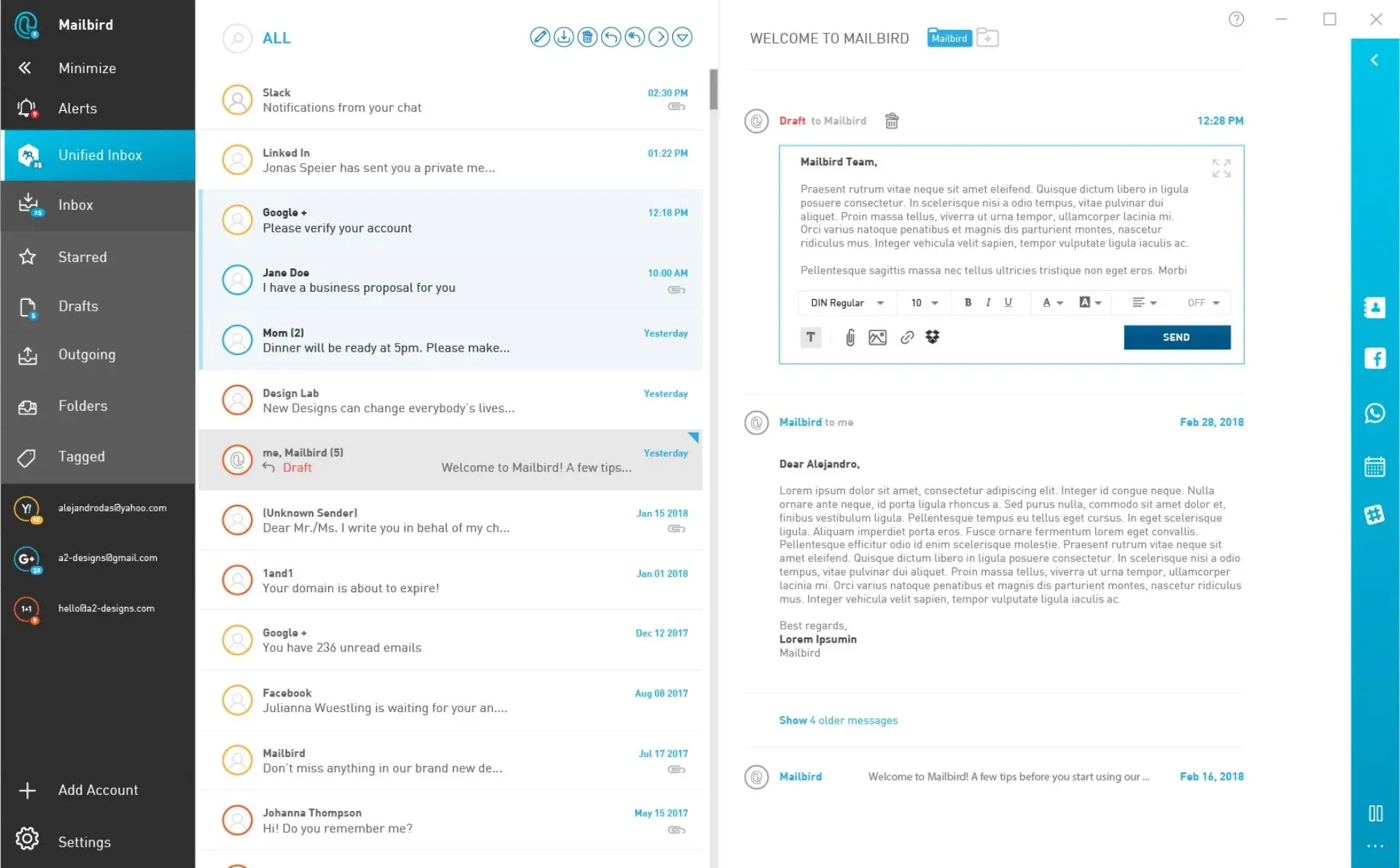
Two columns with icons, instead of one. Cleaned up the symbols/icons. Made dashboard expandable, gave different view options, font changes, contrast and the ability to have two windows open at the same time.
Check the images below in full-res to see more. ↓