
Design & Front-end, from Figma to a hand-coded site
A website for KONA, a small specialty coffee shop in the centre of Granada. I designed the brand system in Figma and built it myself as a static site in plain HTML, CSS and JavaScript: twelve pages, two languages, no framework and no build step. The tokens in Figma and the custom properties in the CSS are the same system, named the same way, so every component on screen comes straight from the library.
KONA is a neighbourhood place: breakfast, brunch, good coffee and bags
of Paisano, a specialty roaster from Granada, to take
home. The site had to do a few simple things well: show the menu, sell
the beans, explain the loyalty cards and make you want to come in for
breakfast.
The direction is paper and ultramarine. A warm off-white page, one electric blue for everything, and a lime that only appears where something needs your attention. A clean sans for structure and an italic serif for the voice, so a heading reads like the shop talks: Specialty coffee and morning people.
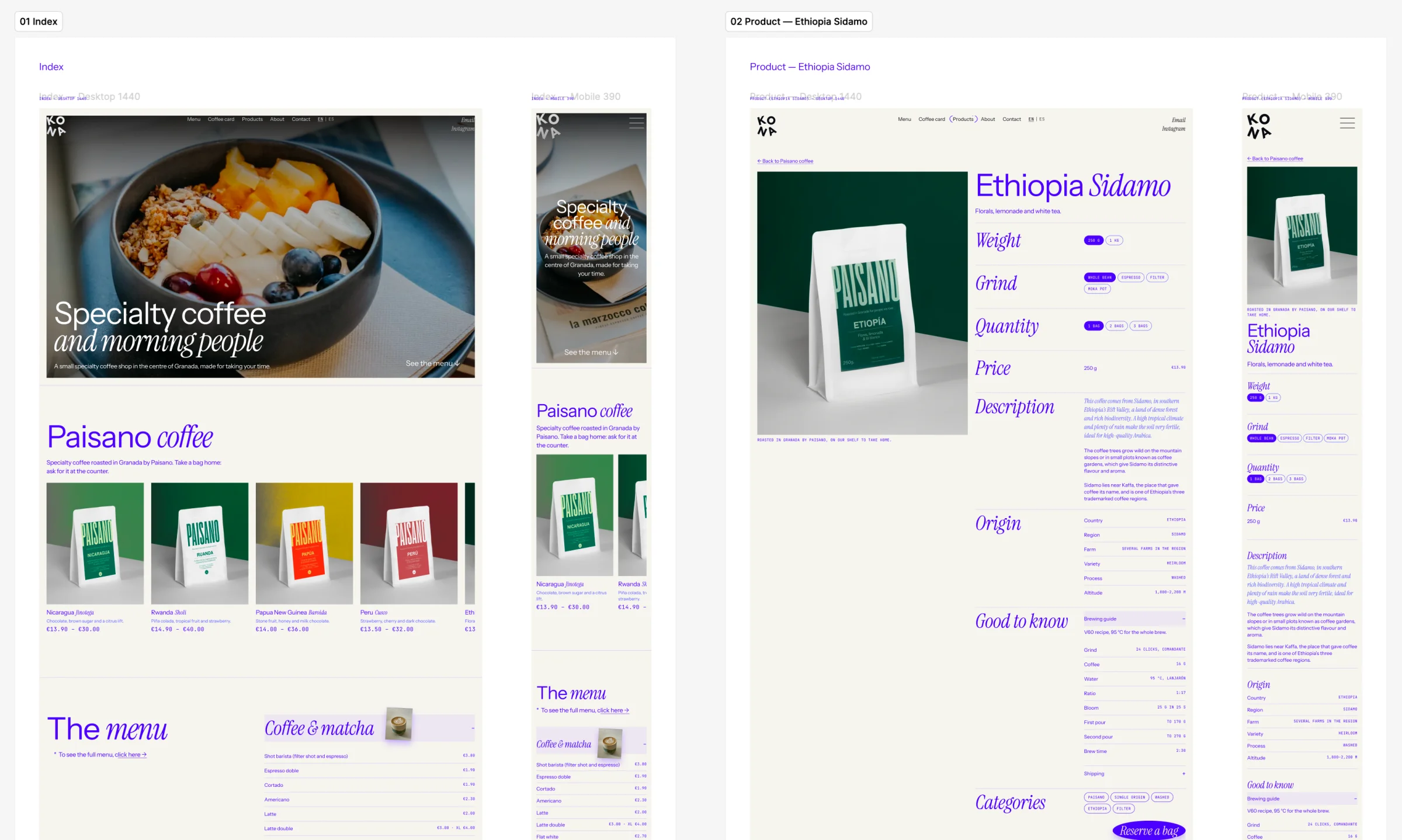
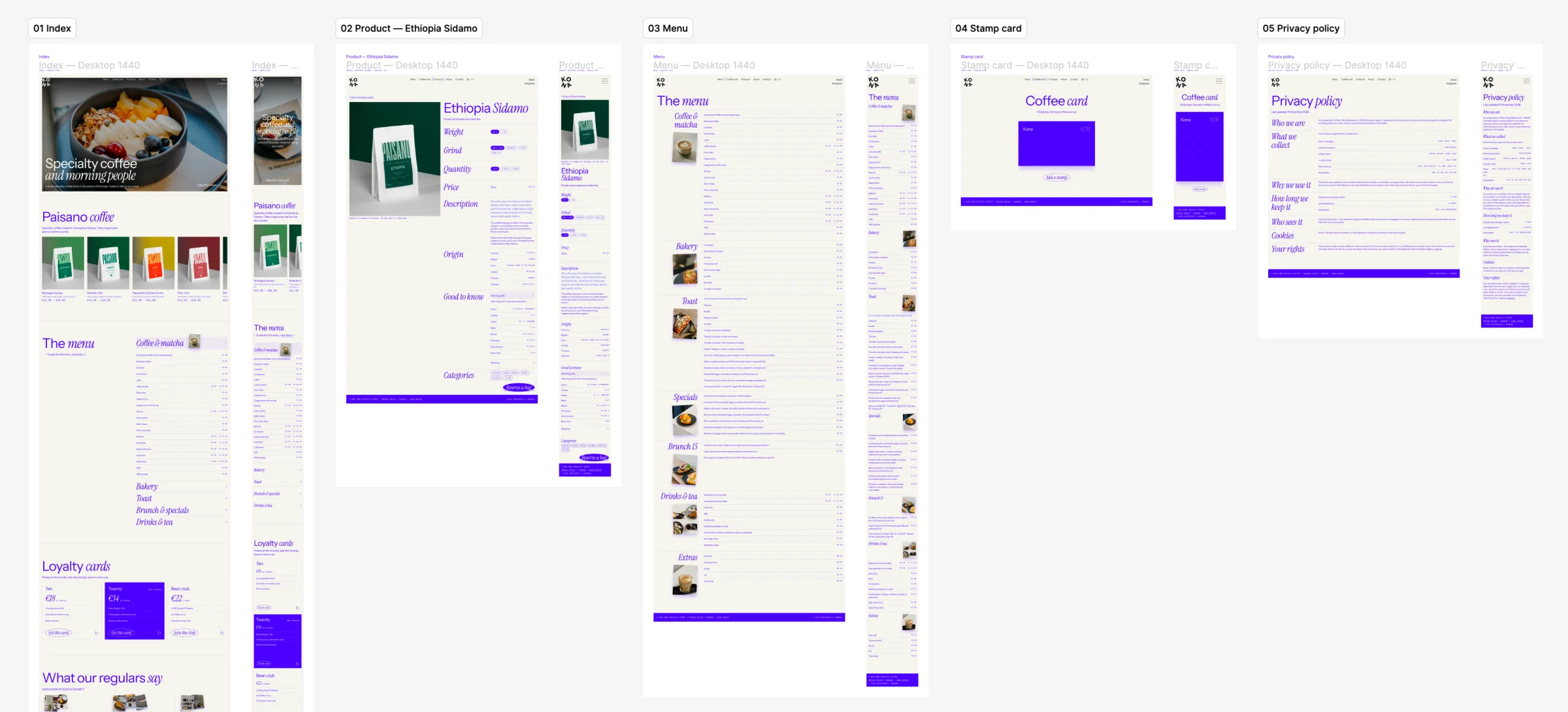
Every page is designed at 1440 desktop and 390 mobile side by side. The home page goes from the breakfast hero to the Paisano shelf, the menu, the loyalty cards and what the regulars say. Each coffee gets its own product page: weight, grind and quantity as pills, origin data, a V60 brewing guide and a Reserve a bag button.
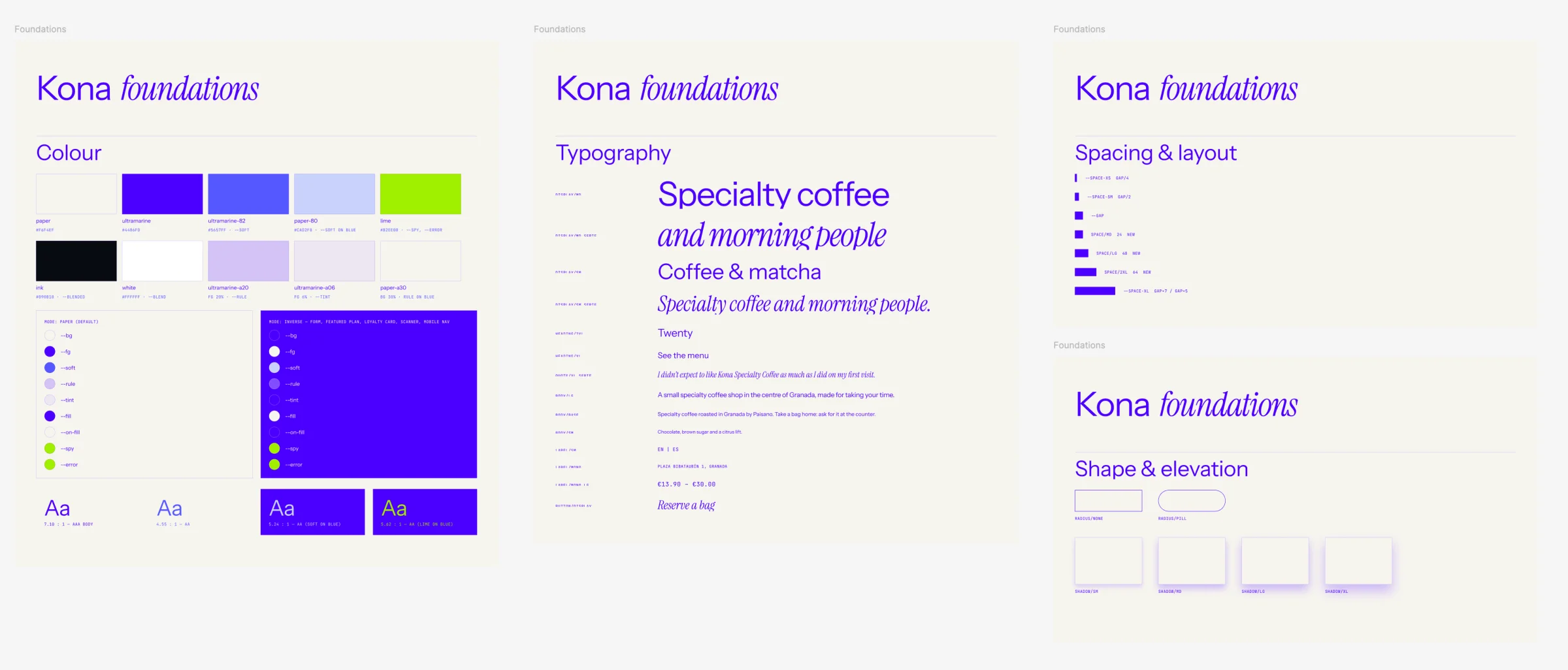
Colour starts from two values, paper
#F6F4EF and ultramarine #4406FD; every other
tint is mixed from them. There are two modes: Paper,
the default, and Inverse, where the whole set flips
for the blue blocks (forms, the featured plan, the loyalty card, the
scanner and the mobile nav). Every pairing is checked: blue on paper
is 7.10:1 (AAA), soft blue on blue 5.24:1 and lime on blue 5.62:1.
Typography pairs Instrument Sans with Instrument
Serif italic, with a monospace for prices, labels and addresses.
Spacing is always a multiple of one gap, from
gap/4 to gap×7, and
shape is kept to two radii, none and pill, with four
soft blue-tinted shadows.
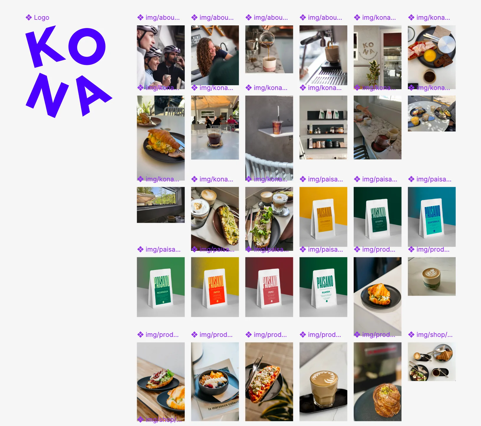
The KONA mark sets the four letters at angles, as if they were dropped
onto the counter. Around it sits a curated photo library from the shop
and from Paisano: breakfasts, pastries, latte art, and every bean on a
colour backdrop matching its bag. In Figma each photo is a named asset
(img/about, img/products,
img/shop) mirroring the folders on the site, so the
design and the code point to the same files.
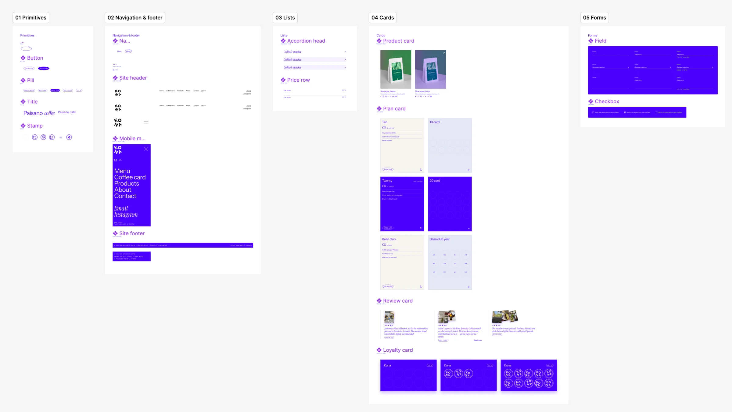
Built up in layers: primitives (button, pill, title, stamp), then navigation (header, mobile menu, footer), lists (accordion head, price row), cards (product, plan, review and loyalty) and forms (field and checkbox, designed in the inverse blue mode). Each one carries its states and variants, like the loyalty card going from empty to full.
In the code each component is a BEM block (.menu__item,
.loyalty__stamps) living in its own cascade layer, so a
component never has to fight the base styles for specificity.
No framework, no build step: twelve pages, about 2,300 lines of CSS and four small scripts. Modern CSS does most of the work, JavaScript only where CSS can’t reach.
color-mix() tokens: a theme is two valuesclamp(), subgrid, :has() and a container query